Introduction:
Original Design:
Credit to: http://blogs.adobe.com/aemmobile/2013/09/ad-of-the-week-home-depot-in-martha-stewart.html
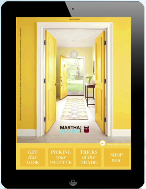
This design was in a Martha Stewart magazine to advertise DIY projects and Home Depot.
Analysis:
Contrast:
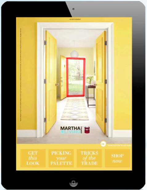
- There is contrast between the bright yellows of the walls and the open door. Our eyes are drawn to the area in the red box in the very center of the design because it contrasts with the rest of the picture.
Repetition:
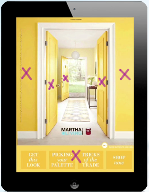
- There is a lot of color repetition in this design. They bright yellows are all over the picture. The doors, the walls and even the graphic at the bottom of the design share the same light yellow.
Alignment:
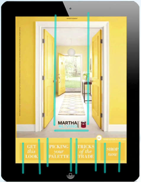
- The alignment of the text has been centered at the bottom of the design. The company name and logo is aligned with the center of the image.
Proximity:
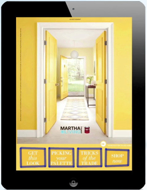
- The text at the bottom of the design show their relationship to each other because they are in a box and have some white space between the each of the boxes.
Color:
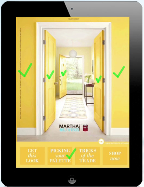
- The colors used in the design are very bright. The warm yellows bring a sense of comfort to the viewer. The bright whites in the trim and the floor also amplify the intensity of the yellows on the doors and walls.
Conclusion:
The first thing the viewer should notice is the repetition of color. The bright yellows jump out a the viewer and give them a feeling of warmth and comfort. Next, the viewer should notice the contrast and their eyes would settle at the middle of the design, where an open door is revealing the beautiful outdoors. After the viewer has taken all of that in, they should notice the text below.
